Showing posts with label silk. Show all posts
Saturday, January 30, 2016
Collection SS2016: Interferences d'Antonio Asis
Born in Buenos Aires, Argentina, in 1932, Antonio Asis is the Hermes guest artist for the spring/summer season 2016. He trained at the National School of Fine Arts in his native city, where he won numerous prizes before moving to Paris in 1956, like many other Latin American artists, including Jesús-Rafael Soto or Julio Le Parc.
Invariably abstract, his work quickly embraced Op Art, exploring the purely optical illusion of movement, in contrast to Kinetic art, which sought to incorporate real, physical motion. Antonio Asis’s Op Art compositions respond to the viewers shifting gaze: their geometric forms and dancing colours seem quite literally to come to life. The silk carré becomes a vibrant, living surface.
Labels:
Antonio Asis,
H432964S,
Interferences d'Antonio Asis,
silk
Saturday, January 4, 2014
Collection: FW2013: Parcours d'Hermes
The effect of this scarf, titled "Hermes Journeys" is equally magnetic and drawing the viewer inside the maze in an enchanting song of hide-and-seek.
What I love is the two dots, in opposite corners, breaking the monotony of the "game", and adding an extra layer of charm to this otherwise mythical silk journey of discovery.
Saturday, November 9, 2013
Collection FW2013: Carré Cube
"Carré-cube" - a geometric design meant to draw you in and have you lost in a 3D maze of mystery and silk - or silk and cashmere, as is the case with the scarf above.
"Carré" in French means square, and the word stuck for the scarves which come in a square shape. The name of this scarf is also a witty twist on geometry terms - squared and cubed being the measurements most often associated with surface areas and volume respectively.
Saturday, November 2, 2013
Collection: FW2013: Petit Duc
After a long hiatus, I am coming back with a stunning design from the Fall/Winter 2013 collection: Petit Duc (Small Phaeton). The breakdown of the landscape into four quadrants, the juxtaposition of the various parts against the overall phaeton (itself enclosed in a wheel) suggests a blueprint of a beautiful idea that comes, triumphantly, to life.
Something as delicate as silk, wrapped graciously around someone's delicate neck, depicts elements of engineering and rough, street pavement-hitting hardware - each of which is designed to make life more enjoyable.
Note the rich yet warm colours, and the sophisticated look this scarf brings to its wearer.
Saturday, June 18, 2011
Collection SS2003: Escales Mediterranéennes
Today is not too hot, not too humid, just pleasant enough to stroll along the lake shore and savour the sight of calm waters upon which swans look on to the sailing boats. A perfect summer day! This sight made me think of the "eternal" Mediterranean, a universe into itself that is both the cradle of our civilization and a vast patrimony of humanity.
Created by Christine Henry and issued in 2003, "Escales Mediterranéennes" ("Mediterranean Stopovers") is a tribute to the element that has defined civilizations - a Sea that has become at once a mosaic of colours, cultures and spirituality. The three monotheistic religions developed around its waters. Its shores saw the "inventions" of numbers, arithmetic, astronomy... in effect, of all science. Here is where the great myths were born, such as the story of Atlantis, the island lost under the sea, or that of the sirens who attempted to inveigle Ulysses (the most famous hero of Antiquity) and who threw themselves into the sea and drowned. So many tales have been recounted, in fact, that even the ancient Library of Alexandria (or its modern sister) could not boast enough shelf space to house them all.
Just to get an idea of how variegated the Mediterranean cultures are, consider only how its ever-changing colour made it so difficult to reach consensus and proved equally fascinating to mankind. The Sea is sparkling and pink at daybreak, azure in the mid-day heat, a cloudy emerald hue near the rocky coastline, golden as the sun sets, gray or midnight black when beset by inclement weather and white foam-lashed with shades of silver when the wind whips it into a fervour. And no sooner have we defined the colour of its waters than its mood changes and shifts to yet another place along the visible spectrum.
This post invites you to plunge head-on into this imaginary voyage, where symbols of the Roman, Greek, Turkish, Spanish and Arabic cultures are gracefully depicted among the sea's natural treasure - fish and aquatic plants. This intermingling of elements is a close reflection of what a real explorer would be set to discover: vestiges of the Roman world in Libya, prehistory in Sardinia, Greek cities in Sicily, the Arab presence in Spain, Turkish Islam in Yugoslavia ...a diversity born out of commerce and wards.
The scarf is superb and ageless - both when displayed and when tied - thanks to the designer's painstaking rendition of the details of each graphic element and to Hermes for the magnificent colour combinations.
Labels:
carré,
christine henry,
Escales Mediterranéennes,
Hermès,
silk,
twill
Saturday, June 11, 2011
Collection SS2005: Les Triplés
Having welcomed the summer in full force (save for a short-lived cooler period), I thought of the time of yesteryears when the arrival of June meant vacation-dreaming - destinations, activities, discoveries. It was one of the most exciting periods, at a time when life's worries were a thing for adults.
Les Triplés (The Triplets) is a children's book series that has been adapted successfully to the silver screen and - thanks to Hermes - to silk. One of the most successful designs ever produced, the illustrations depict the Triplets' adventures in Paris, featuring key identifyable monuments around town as the backdrop.
The colours are very warm, from baby pink and blue to yellow and green - a splendid harmony of colours that invite you to savour every scene in admiration and dream!
Labels:
carré,
Hermès,
Les Triplés,
Nicole Lambert,
silk,
twill
Saturday, May 28, 2011
Collection FW2009: Jardins de la Nouvelle Angleterre
I fell in love with this scarf since the moment it was launched, and I'm surprised as to how I managed not to give it a place of honour in the list of beautiful scarves.
"Jardins de la Nouvelle Angleterre" ("Gardens of New England") lets you admire, as if through a lens, the beauty that the pictures landscapes display. Looking at this landscape depicted on the scarf, I have the distinct impression I'm coming out of an expedition through the forest to an opening where life is idyllic - trees, plants, racoons, a river stream ... rich fauna and flora that coexist harmoniously with the human inhabitants.
The scarf ties wonderfully and the colour combinations (the red, depicted above, the forest green and the taupe, below) are absolutely phenomenal !
Saturday, May 21, 2011
Collection SS2011: Grand Manège
Only a few riding schools around the world have managed to preserve the equestrian art intact over the centuries and cultivate people's admiration for the horse. Since the development of engines and the introduction of cars, horses have no longer been playing as critical a role in people's lives. The horse's nobility, beauty and role it played in human history have nevertheless earned it a tremendous respect of the animal.
"Grand Manège" ("Great Riding School") thus pays tribute to the invisible training necessary for a flawless spectacle. Some bits of harness from the Cadre Noir, the prestigious French riding school, have inspired this composition: the ribbons knotted with rosettes to be plaited into the mane of the steed, the cockades to adorn its ears, but also reins and bridle in leather, stirrups with round stirrup pads… These elements have been arranged so as to mirror the "arabesque" figures one can expect to admire during show horses.
As Hermes so eloquently describes it, the equestrian art is born of a mysterious intermingling of effort and humility, of patience and beauty.
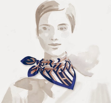
This scarf was first launched in 1990, and reissued several times since then (in 1991, 1993, 1997 and this year in regular size, pleated and as Twilly).
Some colour combinations appear to reflect a younger spirit than others thanks to the presence of several brighter colours that infuse a certain playfulness into the scarf - either way, the actual design is certainly quite traditional so it, alone, would not be sufficient to render the scarf more contemporary.
Labels:
carré,
Grand Manège,
Henri d'Origny,
Hermès,
silk,
twill
Saturday, May 14, 2011
Collection SS2011: Fleurs d'indiennes
An exciting tribute to the craftsmen from India who have enchanted us with their prints at least since the 16th century, when Indian-made fabrics first entered France not only mesmerizing the fashion-sensible population, but also threatening the domestic manufactures.
Aline Honoré, the creator of this design, has explored this beguiling theme before, choosing to focus her attention (and ours) on fabric samples proper in 2008's "coupons indiens" and in 2010's "pelages et camouflages" and "cents plis de miao". In addition, she laid the design of 2009's "la femme aux semelles de vent" on more textiles yet.
The originality of this design stems from the arrangement of the textile swatches as flowers, their metamorphosis into delicate petals infusing a remarkable richness into this overall design. When tied, this scarf features glimpses into fabrics that, like a chest half-open, invites us to discover all the "secrets" hidden within. The pattern, when displayed, may not catch your attention on the spot when compared to the other "jewels" of this collection, but the tied scarf is excitingly youthful, and Hermes' many colour combinations is sure to appeal to even the more discriminate shoppers.
Labels:
Aline Honoré,
carré,
Fleurs d'indiennes,
Hermès,
silk,
twill
Saturday, May 7, 2011
Collection SS2006: Chemins de Garrigue
I caught wind of the upcoming scarf designs, so as we're waiting to admire - and feel - the actual scarves in the boutiques, I thought of paying hommage to the talented artist Christine Henry, whose newest creation will be featured as part of the Fall/Winter 2011 collection (this is in addition to the "Nuées imaginaires" - "Imaginary Clouds" - from earlier this year).
This prolific artist is recognized for her intricate designs that reflect snapshots of both ordinary and extraordinary life, illustrated in a manner that makes you feel as if you hold an entire miniature universe in your palms (or wear around your neck, for that matter). Her "rives fertiles" ("fertile rivers"), included in Hermes' "water"-themed 2005 collection, caught my attention in a profound way, turning her into one of my favourite drawing artists. The fascinating aspect of her work, however, is that she succeeded in growing over the years, exploring various styles (as captured on the 17 designs of hers that Hermes has featured over the years) that appear quite disparate from one another.
Today's "Chemins de garrigue" ("Paths of the shrubland") has been created in the same style - a style that infuses, in addition to dynamism, a tasteful richness and spectacular elegance into this scarf that only a handful of designs can boast. Because the scarf's "footprint" is a square, the shape itself is static. To compensate and infuse energy into a scarf, artists use specific techniques - "tricks" known only to craftsmen and women who've mastered the trade. One of the more obvious techniques consists of developing the designs along the square's diagonals. An alternative technique is Christine's approach to imagine curvy paths across the landscape, rather than straight lines. The winding paths take the explorer on a journey of discovery, inviting you to notice all the details along the way (as opposed to straight lines, where your sight is automatically drawn towards the point terminus of the "journey" and therefore presenting you with the risk of missing everything else surrounding the path).
The inspiration behind this scarf springs from the calcareous plateaus of the Mediterranean shores - the "garrigue" - punctuated by dense thickets of kermes oak, juniper and stunted holm oak. Aromatic lime-tolerant shrubs such as lavender, sage, rosemary, wild thyme and Artemisia are common plants of the garrigue landscape. Calling this shrubland home are sheep, donkeys, rabbits, reptiles and snails alike - examples of which are graciously captured on canvas.
What's interesting is that Hermes' choice of colour combinations to illustrate this design - soft blue, soft pink, rich yellow and black, to name just a few - is very similar to "Nuées imaginaires" from Spring/Summer 2011.
This scarf is not only beautiful, it is utterly elegant, promising a great many heads turning to admire both it and the person sporting it !
Labels:
002294s,
carré,
Chemins de Garrigue,
christine henry,
Hermès,
silk,
twill
Saturday, April 30, 2011
Collection SS2011: Concours d'Etriers
I'm seizing on two important events - the timid arrival of spring and the Canadian Federal elections - to feature a scarf that echoes the former in colour and the latter in spirit.
Concours d'etriers (Stirrup Contest) depicts many of the stirrups discovered by Emile Hermes from lands close and far-away, and diligently added to his personal collection, one of the many manifestations of his admiration of everything related to the noble horse. Another account of some of the stirrups was gracefully captured in the classic "Etriers" scarf that I featured on December 31st of 2009, so I won't insist on the items; instead, I thought it appropriate in light of the Canadian political parties undergoing a contest themselves, in which the de facto leader of the country - the Prime Minister - is to be chosen. As a metaphor for the political landscape, the number of stirrups, and their proximity to each other, make it rather difficult to distinguish and appreciate the individual features and - hence - the beauty of each piece. That is because their number dazzles us; we train our eye to seek out the pieces that somehow stand out - the larger sizes or those of brighter or darker colours. Yet we must quickly develop a "plan of attack" to evaluate each item based on its own merits in order to pass an opinion on which one deserves the top prize - a difficult task, naturally ! Fortunately, the beauty of the collection rests not in the impressive number of items that makes it, but in every piece being carefully selected for its inner beauty - through his intense work and discriminate eye, the collector has done the evaluation for us, thereby helping us tremendously! The question is whether the Canadians will be as passionate and as discriminate as a true connoisseur to choose wisely.
Finally, a word on the arrival of spring (or its hide-and-seek play). The trees in Toronto have finally bloomed (remember, it is May already!) and the sight is absolutely marvelous. The joy triggered by the rebirth of nature is without limits and I've been experiencing this sentiment fully over the last week. I can only imagine what the coming days will surprise us with !
Until then, there's a wonderful surprise in this very scarf design: the way the scarf ties is unexpected and quite beautiful. Similar in spirit with the "Voyages en etoffes", perhaps the the most delicate example in this scarf is the one depicted below, with a combination of blues, cream and light brown for a truly magic effect.
Labels:
002617S,
carré,
Concours d'étriers,
Hermès,
silk,
twill,
Virginie Jamin
Saturday, April 23, 2011
Collection SS2011: La Ronde de Jockeys
A lovely design originally released under the "Ascot 1831" name in 1969 before being reissued once before (AW2004) under its current "Jockeys Round" name. It illustrates twelve mounted jockeys transposed in such a way as to fit within a circle.
I was drawn to this design by the very bright and vibrant colours that infuse a very young spirit into this traditional pattern (take, for instance, the knotted scarf below, whose baby blue and orange - one of my favourite combinations - give a young vibe despite the traditional pattern featured in each of the four corners).
Labels:
carré,
Francoise de la Perriere,
Hermès,
La ronde de jockeys,
silk,
twill
Saturday, April 16, 2011
Collection SS2011: L'alphabet des métiers
A memorable scarf that takes us on a nostalgia path to our childhood and rekindles the passion each of us had for collecting - stamps, rocks, hats, airplane models, and (naturally) cards. As a tribute both to our childhood pastime and to the artisans (the theme of this year's collection), Hermes has reissued "the Alphabet of Trades", illustrating the craftspeople and their trades, matching one of each for each of the twenty-four letters, such as: "Benoit is a baker" and "Pierre is a painter" (I invite you to find Hermes').
This design was launched in 1945, and reissued in 1991 before this year's three more colour combinations.
This design renders the scarf a little traditional, although the many ways of wearing it can easily make is as contemporary as any other.
Labels:
001044,
carré,
Hermès,
L'alphabet des métiers,
Philippe Dauchez,
scarf,
silk,
twill
Saturday, April 2, 2011
Collection SS2011: Le Pégase d'Hermès
Continuing the review of the current season's creations is "Hermes' Pegasus", a fascinating scarf that catches the admirer's eye for two reasons: first, the remarkable rendition of juxtaposed equine drawings is reminiscent of Leonardo da Vinci's sketches intended to explore a subject thoroughly (and to the patron's satisfaction) before the artist began work on the actual canvas, marble or architectural construction. As we look at this drawing, a certain anticipation builds up, making us wonder what the actual creation - which undoubtedly must exist somewhere - looks like. This curiosity becomes our desire to learn more and to discover what intuition, inspiration, creative genius, skill and possible secrets the fruit of this passion entailed. And the canvas' power to elicit our curiosity is the second reason this design fascinates. The text along the four edges of the square tempts the admirer to pay attention to it, in the chance that it may reveal some of the secrets. It is the "other" window into the artist, his intimate thoughts, possible struggles and ingenious solutions. In a word, the writing elicits the desire to be read.
The choice of vibrant colour combinations (for the most part) renders the scarf very young and full of energy. Select areas of the knotted scarf remind me of the "Le monde est vaste" design. Yet the gracious lines of the drawings, unmistakably revealing a horse, assures the viewer that this design is new and deserves to be seen!
Labels:
002631,
carré,
Christian Renonciat,
Hermès,
Le Pégase d'Hermès,
silk,
twill
Saturday, March 26, 2011
Collection FW2009: Littérature
In the age of Internet and emails, writing by hand maintains an aura of elegance and of a delicate treasure, a gift that only a select few possess. For anyone who appreciates hand-made products, the sound of a nib sliding on paper is a tremendous source of pleasure. For those who refuse to follow the flock, pens act as a counterweight to the computer age. And I must confess, I identify myself with this group, not only for my appreciation and admiration for the calligraphers, but also for my fascination with writing instruments - and the ever graceful fountain pen.
The scarf depicts an alphabetical sequence of letters in various fonts, reminding of the gift of reading and writing that we so often take for granted. Like a novel where the stories lie hidden in the rows of letters, words, paragraphs, pages and chapters, this scarf reveals a story as well, and even features words between the lines - literally: not only the more obvious "PARIS" spelled in between the lines, but also "HERMES" - one letter at a time, found in each of the six rows of letters.
Looking at this scarf, I found my mind carrying me to a story shared by Steve Jobs, the founder of the latest world-wide sensation, the iPad. In an address to the college graduates, he shared not only his passion for nice fonts that he studied in college himself, but how his interest, at a time when he didn't know what his purpose in life was, became so relevant when he embarked on developing a new computer and, as part of it, nicer fonts. I found his story particularly relevant because I, too, found myself drawing on the general knowledge I cultivated during my high school and university years.
Deceptively simple, this design is remarkable for the elegance it infuses into the scarf when knotted.
Labels:
001175S,
A.M. Cassandre,
carré,
Hermès,
Littérature,
mousseline,
silk,
twill
Saturday, February 26, 2011
Collection SS2011: Ex Libris dip dye
I spoke about this design before, but I found the Maison's reinterpretation of this pattern in the dip dye variance tremendously appealing, particularly when tied.
The Ex-Libris, featuring two different hues of the same colour, strikes me as utterly sophisticated and a pure joy to wear. Its velvet-like look is an equally appealing characteristic that infuses the scarf with understated elegance.
And to quote a beloved friend of mine, this design is awesome and also awful (as in the original definition, "full of awe" - that's the word originally chosen to describe Christopher Wren's St Paul's cathedral).
Enjoy !!

I'm seizing this opportunity to say that I shall return with my articles in three weeks from today. Keep well until then and I look forward to featuring more scarves after mid-March.
Sunday, February 20, 2011
Collection SS2011: Clic Clac dip dye
In the spirit of savouring the harmony of contrasting beauties the artisans' creative genius produces (this is equally valid when generalized to most aspects of our lives), I will shift my attention in this post to another kind of Hermes silk scarves. Today's post zooms in on the "Clic Clac" design, originally launched in 1980 and reissued in 1997 and 2004 (as well as in cashmere in 2008) prior to this season's dip dye variation. Afterall, an aesthete is a person without a precise identity in today's world, so I must be defined by my choices in the objects I feature.
The design proper has not captivated me as many others have before, in part because the juxtaposition of equestrian devices and of a puzzle-like pattern doesn't speak to me, yet the dip dye finish renders it truly remarkable - hence my choice of featuring it. What caught my attention, however, are the symmetry of the pattern (I'll come back to this in a bit) and the whips, as the predominant motif of the scarf design. I instantly thought of the whip as a strong symbol of the taming exercise - a reflection of the man's desire to make nature work for him, or rather his attempt to domesticate the world. The topic of taming the savage has been explored countless times, particularly in the context of the objectives behind the taming. But what exactly constitutes the savage? Perhaps a concept of a melange of nature and culture (as the embodiment the animal and human being). More poignantly, it is also a an undefined territory as a reflection of a state of mind or even a moral attitude. Adam and Eve were expelled from the garden of Eden into the savage space - the place where humanity is supposed to seek - and achieve - redemption. We perceive that space as a danger, but also as a state of the soul that facilitates our undestanding of the world. Is this the reason why we feel a certain fascination towards the wildness - due to its dual effect of danger and attractiveness?
When we want to explore the savage, nowehere is the search more fruitful than the investigation of the other side of the mirror (this is where the symmetry in the pattern resonated with me). This is one of the main reasons why the theatre and the cinema are equally appealing to me, as venues where the mosaique of the human character is fruitfully explored.
This design did not impress me when the scarf was displayed, for it combines whips with certain geometric patterns that provide a puzzle-like picture overall without a strong connetion to the ambiant world. Yet the scarf ties so beautifully, and the dip dye treatment gives it such a soft, velvet-like appearance, I instantly recognized it as a personal favourite.
This scarf can be either youthful or mature, depending on the colours you'd choose. But either way, the velvet-like finish allows for an experience that's a cut above the other silk scarves...
Saturday, February 12, 2011
Collection SS2011: L’Art du Temari
My interest in traveling and in discovering new places has been rekindled recently when I read an article on one of the most prized museums in Europe, the Museo di Capodimonte in Naples (Italy). The old Bourbon palace is a hidden gem for art admirers thanks to the many masterpieces of the Farnese Collection on display – paintings of tremendous high artistry that reveal so much about the variety and vagaries of the human character (included in the collection is Parmigianino’s beloved “Antea”, an arresting portrait of a beautiful young woman whose image has been used in Italy on everything from fridge magnets to tea towels and Christmas ornaments. The woman’s identity continues to be, like Leonardo da Vinci’s Mona Lisa’s, somewhat of a mystery, while her beauty is truly haunting).
The painting in particular made me think of the fascinating people that inspired such higher creation, people who – like us – held beliefs, followed customs and marked their existence with precious objects to protect them against evil spirits. Neapolitans are famously superstitious people – but then again, who isn't? I smile as I remember following very strict patterns when getting ready for the day ("right foot first" not only for when stepping outside or entering a new place, but also when putting on socks and shoes). Do such habits dissipate since we become aware of becoming more mature? Very unlikely – having lucky cuff links and ties, sweaters and jeans, glasses and even songs is case in point (not to mention that just the other day I caught myself reading my horoscope).
It is therefore in this spirit of lucky charms that Hermes has created “L’art du Temari” (“Temari art”), inspired by the Japanese tradition of offering these fabric balls, beautifully weaved in unique patterns of endless possibilities, as juggling equipment, lucky charms, gifts for births or weddings, for a New Year or a birthday. From humble beginnings as simple toy balls for children's play, Temari create a magnetic effect on lucky recipients and gift-givers alike.
Many lose sight of the superstition involving the amulets themselves: they must be found or received as a gift, and never purchased on one’s own. Such traditions were held the world over, and have been as old as the 32,000-year old Lion Man discovered in Germany’s Hohleinstein Stadel grotto.
As a spectacular decorating focal point, the puzzle of the design is mesmerizing. The equally fascinating aspect is that stitches can go in any direction because of the random wrapped thread surface of the ball: they are not limited to the traditional “up-and-down” or “side-to-side” motions as with traditional stitchery. Of particular interest is the intriguing pattern carried through the scarf’s surface, particularly when the scarf is tied: it appears as if some loose threads have been left undone, an as open invite to the viewer to let his/her imagination explore the endless ways that the patterns can be made. The colour combinations are pretty young, allowing the scarf to match the spirit of both younger and young-at-heart persons, due to the very playful nature of the pattern.
In the spirit of having fun with the scarf, I encourage you to consider knots you haven’t previously sported. Let the play begin!
Labels:
002608,
carré,
Hermès,
l'art du Temari,
Nathalie Vialars,
silk,
twill
Saturday, February 5, 2011
Collection SS2011: Ferronnerie
Last week I was talking about the nostalgia of times past, and this scarf brings to life the romanticized world of craftsmanship as we would experience it today predominantly in History books.
The year 2011 has been dedicated by Hermes to the artisans - the passionate visionaries who invest their time in intellectual or manual tasks, finely sculpting in effect the time in effect creating something with their time. So I couldn't think of a better ode to the creative act performed with passion, pleasure and delight than "Ferronnerie" ("ironwork").
The magic of this design stems from the beauty of the precious creations that ennobled one's life in discreet yet impactful ways; its charm stems from allowing us to realize that nowadays, the need to satisfy an increasingly large market has led to mass-production, resulting in ubiquitous yet uninspiring, mundane objects. Repetitive work, exceedingly uncreative, means degradation - not only of human activity but also of time's significance. Time is better wasted than enslaved and left to shrivel with each day's repetitions.
Real work involves the mind and the entire body, leaving behind wrought iron hinges born of inspiration, contributing to culture and bearing witness to the passion that went into their creation. And how glorious these finely sculpted creations are, and how precious was the time spent creating them ! That's likely because every artist is the parent of what he/she does, not only metaphorically but also viscerally.
This scarf is a successful reissue from 1970 in the smaller format (70cm). The colour combinations in this pattern infuse a great deal of life and joy into the design - sentiments echoed by the presence of ribbons swirling around the edges. Those same colour combinations also instill the vintage air into them, rendering them all the more desirable, despite the more traditional pattern.
Labels:
981522,
Cathy Latham,
Ferronnerie,
Hermès,
silk,
twill
Saturday, January 29, 2011
Collection SS2011: Cuirs du Désert
It hasn't been since Leigh Cooke's 2007 "In the Pocket" design that I felt so exuberant about a scarf - albeit for different reasons. Unlike the last time, when the pattern itself was the trigger of my admiration, today's "Cuirs du désert" ("leathers of the desert") mesmerized me with the colour combinations (for only some, evidently). Upon closer inspection of the scarf design, I was equally taken by the detail of the leather pouches, bags and wallets that surround the Touareg - both as an hymn to the artisans and as a literal reflection of the objects that identify with their owners as they become the Touaregs' companions on the long journeys. The fringes, in particular, are depicted with a great deal of attention to the original details, and that, to me, is thoroughly impressive.
Six colour variations resonated with me so much, I was at a loss for picking the two most impactful to display here, to complete the experience. To paraphrase a friend's reaction (in a different context), this scarf is both awesome and awful - as in the original definition ("full of awe" - the exact words originally chosen to describe Christopher Wren's St Paul's cathedral).
This scarf is a perfect successful example of reviving an original design from 1988 by reinterpreting it in colours that render the scarf contemporary. Its central depiction - the Touareg - triggered in me a nostalgia of the origins. Increasingly fewer people can recall the journeys that the first pioneers undertook, venturing into the unknown to find luxuries available in other parts of the world - and permitting those with a love of the unique a sublime experience and access to a world of dreams. This quest has defined Hermès since the Maison's inception and is perhaps the chief element that resonates tremendously with me - and with all the admirers of the brand.
So in this spirit I am dedicating this post to my friend (A) whose interest in all things beautiful and loyal patronage continues to fuel my desire to bring forth beautiful, phenomenal designs.
Labels:
001786S,
carré,
Cuirs du Désert,
Francoise de la Perriere,
Hermès,
silk,
soie,
twill
Subscribe to:
Comments (Atom)


