One of the more thought-provoking designs of the recent past is "Projets Carrés" ("Projects Square(d)"), launched as part of the FW 2008 Collection (my inspiration came from some ads I noticed posted around downtown Toronto, while riding my bike (I almost fell off my bike in fact seeing those pictures).
The composition is deceptively simple, featuring elements of the horse harness, most presented if not in pairs, at least symmetrically - stirrups, bits, straps - while select elements are on their own, such as a comb and (possibly a hip) strap). Yet the apparent "disorder" in which they are presented triggers a feeling of abundance. This richness is further enhanced by the alternation of the materials these objects are made of - leather and metal - two elements (one organic, one inorganic) that create a certain tension between them (the leather pieces make me think of objects of fetish, which, in combination with the whips, are meant to trigger the viewer's curiosity, sense of intrigue and overall admiration for the design).
What I particularly admire about this scarf are two aspects: one has to do with the very vibrant colour combinations (depicted is the anis green/olive green/brown/gray/copper orange; another design I recently remarked featured a white background against which the same elements are rendered in bright - almost "Valentino" - red). The second aspect has to do with the depiction of the border on the scarf: by way of "inserting" faint white "spots" within the solid border, the eye detects a textured fabric framing the objects captured inside. So powerful is the impression, in fact, that I, along with everyone I knew, felt tempted to touch it to believe my eyes (to the touch, that portion of the silk feels the same as the rest of the scarf). The impression of textured canvas serves as a great base onto which the depicted objects appear as if they are three dimensional (sensation triggered in part by the manner in which the strap, in the lower part of the composition, comes outside the border ever so delicately).
I get many questions about who could wear a certain model - or rather, what does the model best evoke. I'm happy to suggest that this pattern is very young, and even edgy. Indeed, a great design, one that appears equally beautiful when the scarf is knotted as when it is displayed. So wear it with confidence and you'll appear magnificent ! I, for one, have loved this scarf ever since it came out for the design is equally stirring and intriguing.
This is a very interesting scarf, not only for the effect it has on those who seek its meaning, but also for the way it is built - the manner in which the effect was realized.
"Touch Me" is appropriately inviting the admirer not only to take note of what the design conveys, but also - or even more so - to reach out and feel the scarf. The design depicts a pattern that is - indeed - fur (or at least fur-looking). The effect is so powerful, in fact, that you'd be tempted to see what touching the scarf would feel like.
Upon closer inspection, however, you notice that what you took to look like fur is nothing but meticulous hand drawings, similar to the ones we "tried" our hands at, when we discovered the wonderous pencils (or crayons).
I'm not sure what this scarf would look like around someone's neck - but I can only fancy it would look both elegant and intriguing, and awfully warm!
La vie du grand nord ("Life at the Great North") is a tribute to the spectacular life, its struggle and its beauty against immaculate surroundings, at the Pole.
The scarf has been imagined as independent scenes surrounded by "naive" drawings of iconic mamals of the area - reindeer (also known as the caribou in North America), whales, walruses and seals - that bring the story to a harmonious close (this design reminds me of the Pani la Shar Pawnee design, similarly constructed). The inner square depicts, as the focal point, a creation whose four white arms, like four tree trunks, spread in the four "corners" of the universe - perhaps a hyperbole for the source of life - each ending with a rich tree root.
Aline Honore designed this scarf and Hermes launched in 2004/2005; the image depicted below is part of the reissued series (belonging to the Winter 2010 collection), in different colour combinations (the one below is absolutely stunning, the kind of design that takes your breath away).
When knotted, the scarf does not appear as gloriously as when displayed, for the leaf motif, depicted in every corner, is a very abstract element that prominently displays when the scarf is knotted, thereby taking away from the glimpses of true North life that the scarf features in the middle - and which, in fact, not only make for the beauty of it, but also acts as the element of the design that gave the scarf its name; yet, I ancitipate that this will become a very admired and beloved scarf, particularly for those fashion-sensible ladies (and sophisticated gents?) who recognize that true success depends only on taking chances - in fashion as in life.
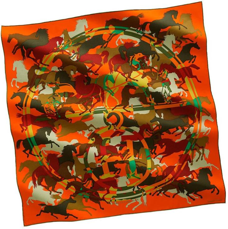
"Ex-libris" is a Latin phrase that means "from the books" (often used to indicate ownership of the book). This scarf pays tribute to the very symbol of the Maison, the carriage, the splendid horse and the groom. Legend has it that Emile Hermes chose this design as his personal "signature stamp" on every book he owned, when he decided to bind each one in the same leather cover.
The design proved so successful and influential, it proved the inspiration behind the House's emblem because it best captures - and encompasses - the essence (and raison d'etre) of Hermes.
The camouflage, artfully obtained by countless silhouettes of galloping horses, adds a contemporary feel to this otherwise timeless symbol. Once I recognized the overall pattern, I laid my eyes on the focal point of this scarf, the "H", above which the unmistakable "duc" (the elegant calash), the groom in livery attending to the horse, and the noble horse itself, stationary, dreaming of mad careerings...
I find this particular pattern sublime, for its vibrant, unconventional colours infuse tremendous energy into the scarf, rendering it not only contemporary, but uniquely timeless. As only select patterns succeed, it displays as beautifully as it appears knotted. This scarf is a definite "hit".
The shot below, featuring this pattern, was chosen to represent this season's collection. Wonderfully conceived and skillfully depicting the scarf, this add equally intrigues and mesmerizes the admirer.
Back in May 2010, Martha Stewart decided to invite Hermes' North American President, Bob Chavez to her show (accompanied by scarf specialist Susie diCecco, the House's aesthete in charge of artistic displays of scarves). Martha, in her characteristic style boasting about how many scarves she bought as well as received over the years, was wearing this scarf in brown, appearing to have received it as a gift right before the show. Needless to say, it was impactful yet discreet (and utterly elegant) - the perfect accessory.